_edited.png)
OR... DIRECTION 3
The second semester had me going through another process of sketching and refinement as I changed major portions of the design concept. I will take you through a more detailed process of this portion of the project... starting from new research and user research, sketching and prototyping, building a website and content, and building up presentation materials.
Okay... Ready?

SECONDARY RESEARCH
Memorial Design
Moving fully into a memorial design, I needed to broaden my knowledge in this area. I got three relevant books and continued to research online. I went through many different types of online memorials and looked into artistic installations for memorials as well.
I mainly learned that (1) Memorials need to be abstract and simple so that it is easy for people to apply their own meaning, (2) there are a variety of feelings you can focus on, choose a few, (3) a small touch of personalization can go a long way.
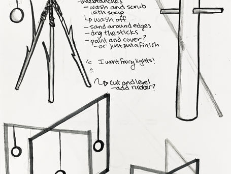
SKETCHING

PROTOTYPING
From Paper to Ceramic
The real question is... How do I make this paper forms in ceramic? The first solution was trying out slab building techniques, leading to some strange scaffolding and hanging, using balloons, and folding over cups. After talking to another student in the ceramics room, this changed over to slip casting. She taught me how, and I tried out a cylinder... The cylinder easily molded into the shape I desired, and ended up becoming a lantern that works both on the ground and hanging.


WEBSITE PROCESS
Wireframe, Content, and Visuals
The other half of this project is the website! This is where people go to view the project description, see online memorials, view the installation, and submit their own memorial. The goal was to make this easy to understand and follow, while also creating a sense of reason and conviction in the user to actually do the project... What is this conviction? It is me getting personal with my own story and the reason for starting the project.
Overall, I decided to keep everything simple and somber; black, grey, and white, with the occasional bright orange. As usual, the actual building of the website took longer than expected! I used webflow... but left any animations and extra interaction stuff to the end.


